 EN

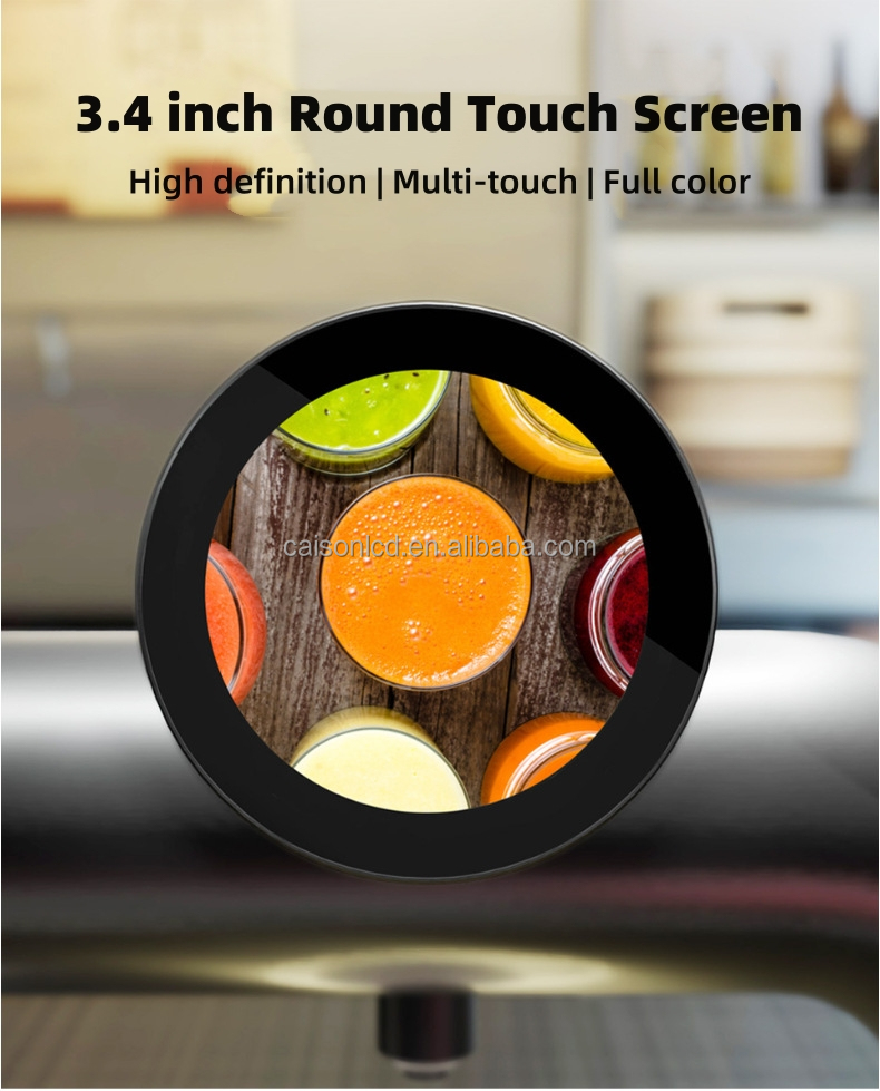
A circular display changes more than the outline of a screen: it changes how viewers read, notice, and remember visual media. Its curved boundary can echo a product, symbol, or architectural feature, making the message feel integrated with its setting. For designers, a circular display offers a distinct canvas that can make a visual idea feel intentional rather than simply placed on a rectangular panel.

The design benefits are strongest when the format supports the content, not when shape is treated as decoration. A circular display can focus attention, create visual continuity, and introduce motion that works with a curved composition. Understanding these advantages helps retail, hospitality, and public-space teams decide how to adapt layouts, messages, and installation plans for a screen that does not have conventional corners.
How the Shape Changes Visual Hierarchy
A natural focal point for key content
A circular display has no obvious top-left corner to establish the usual reading path, so designers can build hierarchy around a central focal point. A product image, short message, or emblem can occupy the middle, while supporting details sit around it. This makes the circular display useful when one idea needs to register quickly, especially in a busy storefront or reception area.
The boundary also helps separate the visual from surrounding signage. Because a circular display contrasts with common rectangular screens, viewers may notice its form before reading the full message. That first glance is valuable only if the layout is clear: a circular display should use restrained copy, sufficient spacing, and strong contrast so that the focal point remains recognizable from the expected viewing distance.
Content arranged around a center
Designers can use a circular display to organize material radially, placing labels, icons, or visual cues along a curve that leads the eye back toward the center. This arrangement can suggest cycles, rotation, connection, or completeness. In a circular display, those associations should match the subject; otherwise, a ring-shaped layout may add visual complexity without making the information easier to understand.
The format can also frame a single object in a distinctive way. A beverage image, clock face, or campaign mark may feel cohesive when its composition follows the screen outline. For this reason, a circular display often benefits from artwork designed specifically for its dimensions rather than a cropped rectangular graphic. Purpose-built files help avoid clipped details and awkward empty areas at the edges.
Creative Advantages for Motion and Branding
Motion that reinforces the message
Animation can make the geometry of a circular display part of the story. A moving dial, orbiting graphic, or gradual reveal can guide attention around the screen, while a transition that returns to its starting point can feel seamless. The motion should remain legible and measured: on a circular display, fast movement near the rim may distract viewers from the information placed in the center.
Looping content is especially practical where people pass by rather than watch a full sequence. A circular display can present a concise message, then return visually to its opening frame without an abrupt cut. Teams should preview the loop at actual screen dimensions and viewing distance. What looks smooth on a design workstation may appear crowded when text and animation share a compact circular display.
A recognizable brand expression
The distinctive silhouette gives a circular display a clear role in visual identity. It can echo a logo, packaging shape, or interior detail, helping a campaign feel connected to its environment. The match does not need to be literal: consistent use of color, typography, and image treatment can make a circular display feel like a considered extension of a brand system.
That expressive value depends on restraint. If every message is forced into a ring, the format may compete with the content instead of strengthening it. Use a circular display for themes that benefit from a central image, contained composition, or sense of movement, and keep essential wording concise. This selective approach helps the screen stand out while preserving a coherent experience across other visual media.
Practical Design Considerations for Deployment
Adapting layouts and readable text
A circular display requires a different safe area from a standard panel. Important text and logos should stay away from the outer curve, where limited space can make letters feel cramped or risk clipping. Establish a central working zone, test the smallest type at the intended distance, and review every visual on the actual circular display before publishing it in a live environment.
Content teams should confirm file dimensions, aspect requirements, and playback behavior with the display system before producing a full campaign. A circular display may need a square canvas even though the visible area is round, so artwork outside the active region must be planned deliberately. Templates can make revisions faster, but they should preserve flexibility for photography, motion, and different message lengths.
Matching the screen to its setting
Placement determines whether the shape improves communication. A circular display can complement a feature wall, product zone, counter, or suspended installation, but it needs a clear sightline and suitable surrounding space. Consider ambient light, expected audience movement, mounting constraints, and nearby signs. When the environment is visually crowded, a circular display may need simpler content to remain easy to notice.
Before installation, teams should define the screen's communication task and the content cadence. A menu highlight, wayfinding cue, brand animation, and product story require different pacing and information density. A circular display supports a focused message particularly well, while detailed instructions may need an accompanying channel. This decision keeps the form useful and prevents the screen from being asked to carry more information than viewers can absorb.
FAQ
What content works well on a circular display?
Concise messages, bold imagery, symbols, and motion built around a central subject are usually a natural fit. A circular display is also effective for content that suggests rotation, cycles, or continuity. Detailed text can work when it is brief, well-spaced, and tested at the intended viewing distance.
Does a circular display need custom artwork?
Custom artwork is not mandatory, but layouts created for a circular display usually use its space more effectively. Designers can protect key elements from the curved edge and compose around the center. When adapting existing assets, preview the crop and adjust spacing, type size, and image placement before release.
How can teams keep the message readable?
Keep copy concise, maintain strong contrast, and place essential information within a comfortable central area. Review the circular display in its real setting, because viewing distance and ambient light affect legibility. Use motion selectively so that animation supports, rather than competes with, the message.